Plan a simple header and footer navigation that helps shoppers reach products, policies, support, and useful content without menu overload. This guide focuses on decisions a small or growing merchant can apply without adding unnecessary complexity. The goal is a store experience that is understandable to customers and workable for the people who process the order.
For app-specific context, you can also use the Instant COD App Guide and the installation guide alongside this article.
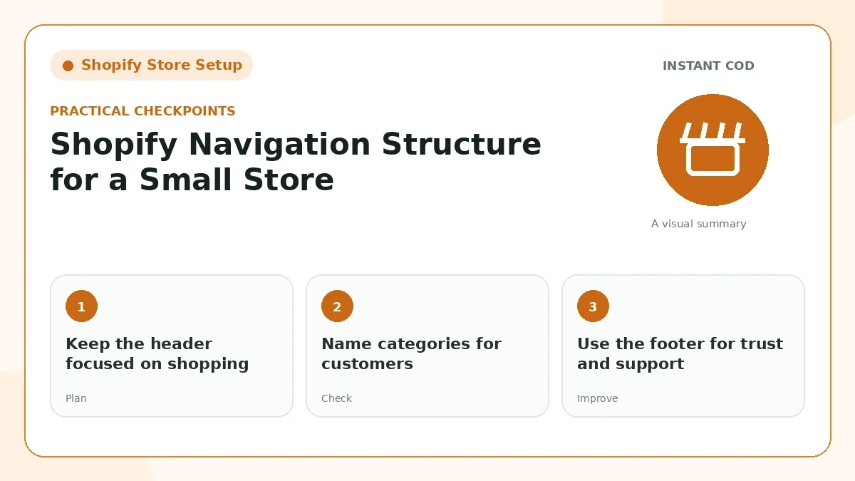
Keep the header focused on shopping
A small store rarely needs ten top-level links. Prioritize collections or categories customers understand, a search entry when useful, and a clear path back to the homepage. Secondary information can live in the footer.
For “Keep the header focused on shopping,” make the change in a way your team can explain in one sentence. Then place a test order or open the public page as a customer would. If the result needs a long internal explanation, the customer-facing version is probably still too complicated.
Name categories for customers
Use labels such as Kitchen Accessories or Health & Fitness when those are the words customers recognize. Internal business terms and clever category names slow navigation.
This part of the workflow should match the wording elsewhere on the site. Compare “Name categories for customers” with the product page, policy pages, form labels, and confirmation message so a buyer does not receive two different versions of the same promise.
Use the footer for trust and support
About, Contact, Shipping, Returns, Privacy, Terms, FAQs, and helpful guides belong naturally in the footer. Group links so visitors can scan rather than reading one long list.
A useful check for “Use the footer for trust and support” is to look at recent support questions and failed orders. Repeated confusion is evidence that the page or process needs clearer information, even when the design itself looks polished.
Avoid dead ends
A navigation link should lead to a useful page. Empty collections, placeholder pages, and “coming soon” links make the store look unfinished and are frustrating for both users and crawlers.
Keep “Avoid dead ends” easy to maintain. Prefer a rule or piece of content that can be updated in one place, documented for staff, and tested after a theme, app, courier, or policy change.
Check the mobile menu separately
Desktop navigation can look fine while the mobile drawer becomes too long or hard to close. Test nested menus, tap targets, scroll behavior, and the visibility of account/cart actions on a real phone.
On mobile, review “Check the mobile menu separately” with limited screen space and a slower connection in mind. Important information should remain readable without relying on hover effects, tiny helper text, or a sequence of popups.
Review menus as the catalog changes
Remove categories that no longer have products and add new links only when they help visitors. A small, maintained menu is better than a large menu that reflects the store’s history instead of its current catalog.
Finally, do not treat “Review menus as the catalog changes” as permanent. Revisit it after enough real orders or search data has accumulated. Small stores improve faster when they compare outcomes before and after a change instead of following a fixed template forever.
Practical review checklist
- Test the experience on a real mobile device.
- Keep customer-facing wording consistent with the store’s actual process.
- Make important support and policy information easy to find.
- Review the resulting Shopify order or public page, not only the front-end design.
- Update the guide or workflow when the platform or business process changes.
What a good implementation looks like
A strong implementation of Shopify Navigation Structure for a Small Store feels ordinary to the customer in the best sense: the next action is obvious, the wording matches what actually happens, and important details are available without searching through several pages. For the merchant, the same setup should create information that is easy to find in Shopify or in the public site editor. If a process depends on one staff member remembering a workaround, it is not finished yet. Document the decision, test it after changes, and keep the public explanation aligned with the real operation.
Continue with related guides
For the next step, you can also read Return and Exchange Policy Guide for COD Stores COD Return-to-Origin (RTO): What to Track and Why. The resource library keeps related COD, store setup, shipping, trust, and SEO topics in five focused categories.
Official references
For platform-specific details, review Shopify navigation documentation and Shopify products documentation. Platform behavior and policies can change, so primary documentation should be checked when a decision depends on a current rule.
Final takeaway
A professional ecommerce workflow is usually the result of many small decisions being consistent: clear wording, realistic expectations, useful customer details, accessible support, and a process the team can actually follow. Keep the implementation simple enough to maintain, then improve it using real order and support data.
Frequently Asked Questions
What is the main goal of Shopify Navigation Structure for a Small Store?
Plan a simple header and footer navigation that helps shoppers reach products, policies, support, and useful content without menu overload.
What should I test after making this change?
Test the storefront on a real phone, browse the affected pages, complete the purchase or COD path you actually use, and then verify the resulting customer and order information inside Shopify.
Should I change several store settings at the same time?
Small batches are easier to review. Change one logical area, test it, and note the result before moving to the next so any problem is easier to trace.
How often should I review this setup?
Review it after theme changes, product or shipping updates, and whenever support questions show that customers are struggling to find or understand something.